


Blending demystified | Hear My Voice Deciding
The new Hear My Voice Collection + having fun with digital blending


Today’s post is quite long and so if you’re reading by e-mail it’s likely to get truncated - pop on over to our full archive of articles to read the full version online here.
QUICK STEPS TO NON-SCARY BLENDING, BY LYNN
A subscriber recently asked for tips and tricks for blending. I suspect that is something I’ll return to a few times (hopefully with videos too) but today I wanted to share a short list of some of my own tips and tricks learned along the years playing with blending in Photoshop. (This tutorial is very geared to Photoshop but I am sure the ideas will be able to be replicated in the software of your choice, provided it has blend modes).
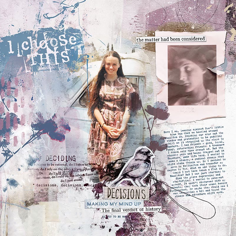
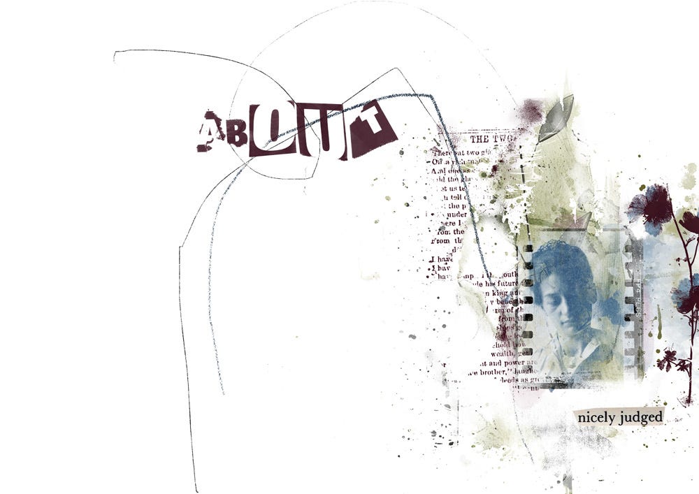
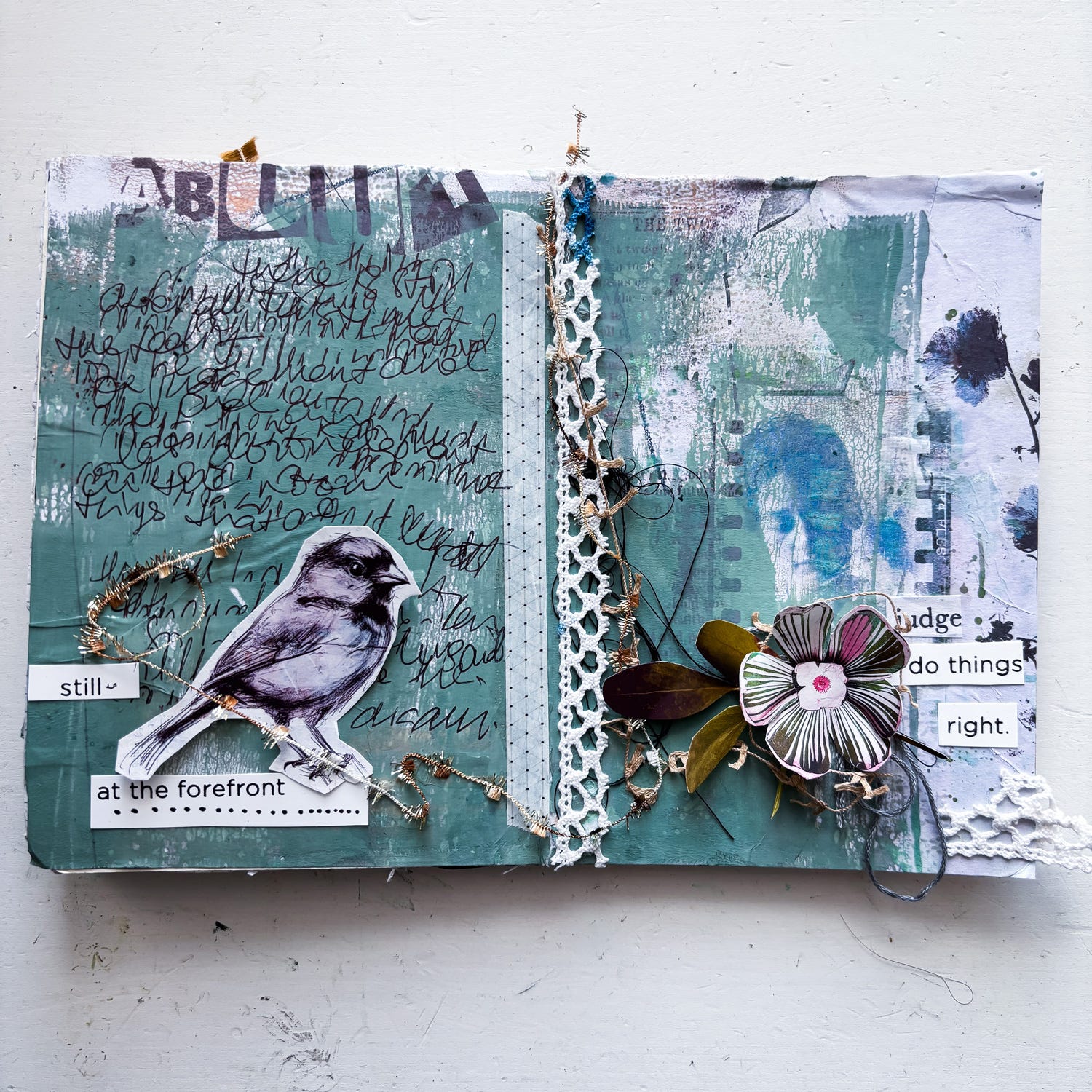
I made this page with the latest Hear My Voice Collection (about my decision aged 19 to switch to a new university and move away to a new city where I knew no-one) and thought it was a good example of blending a photo into a background and adding mixed media.
Blending is one of those things that I think a lot of us would like to do more often, but gets put in the ‘too hard’ basket. But whenever I DO make the effort, I remember again how satisfying it can be .
So, here’s what I’ve learned:
* YOU NEED TO MASK UP
For my page I chose one of the collage-style papers from the new Hear My Voice collection. You can try blending into any paper but something relatively light to moderately coloured with a decent amount of texture is best, and it’s hard to get a good result on a patterned background with a busy small repeating pattern.
Then I added a shape to be the mask for my photo. I used a brush already loaded into my brushes, and you may already have some in your brushes that will work. If not, you can search ‘masks’ in stores such as The Lilypad (below are a couple of my packs).
Shapes with irregular and distressed/soft/watery edges are best for pages like the one I am making today.
A cheeky tip: you can also try decreasing or increasing the lightness (Image>Adjustments>brightness/contrast) of one of our painted transfers from our collections to end up with just a black or white shape that you can use for a mask. You can also re-use masks that may come as part of a template.


I “clipped” my photo to the mask by holding down the Option (Alt) key while at the same time hovering your mouse on the layers panel between the two layers. When a symbol appears (a small box with a downward arrow), I click with the mouse.
Don’t merge the layers just yet though! Because now you can move around your photo and/or resize it to change how much is showing. AND you can play with the clipping mask too!
NB The masks shown above come as abr brushes as well as png shapes, so you can load these soft blendy brushes into Photoshop and use them as erasers.
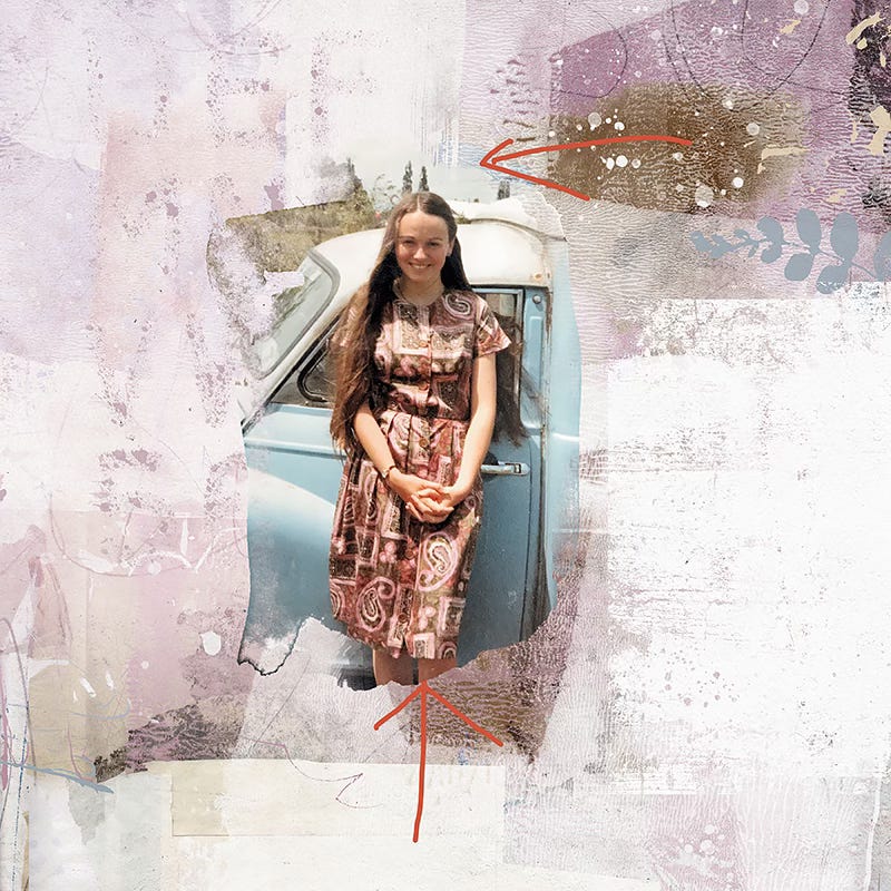
You can erase any part of the mask that you don’t want, or to make a more interesting shape. And you can also add to the mask to reveal more of your photo. I actually did this with a soft watery brush at the top and bottom of my mask (see the arrows below)
Once you are happy you can merge the photo and the mask so you just have an irregular shaped photo.
*DON’T STOP TOO SOON!
A lot of people stop there.
And on some pages that can work well. I sometimes have irregular edged photos on a white background in my travel photobooks, for example.
But the clue is in the name here - BLENDING. Usually our aim is to seamlessly blend the photo INTO the background paper. To do this you need to use your ‘blend modes’ (no surprises there!)
(For those new to blending, you need to have your layers palette open, then click on the little arrow next to ‘normal’ to access the drop down menu of blend modes.)
First, I put my photo onto ‘Linear Burn’ at 36% opacity.
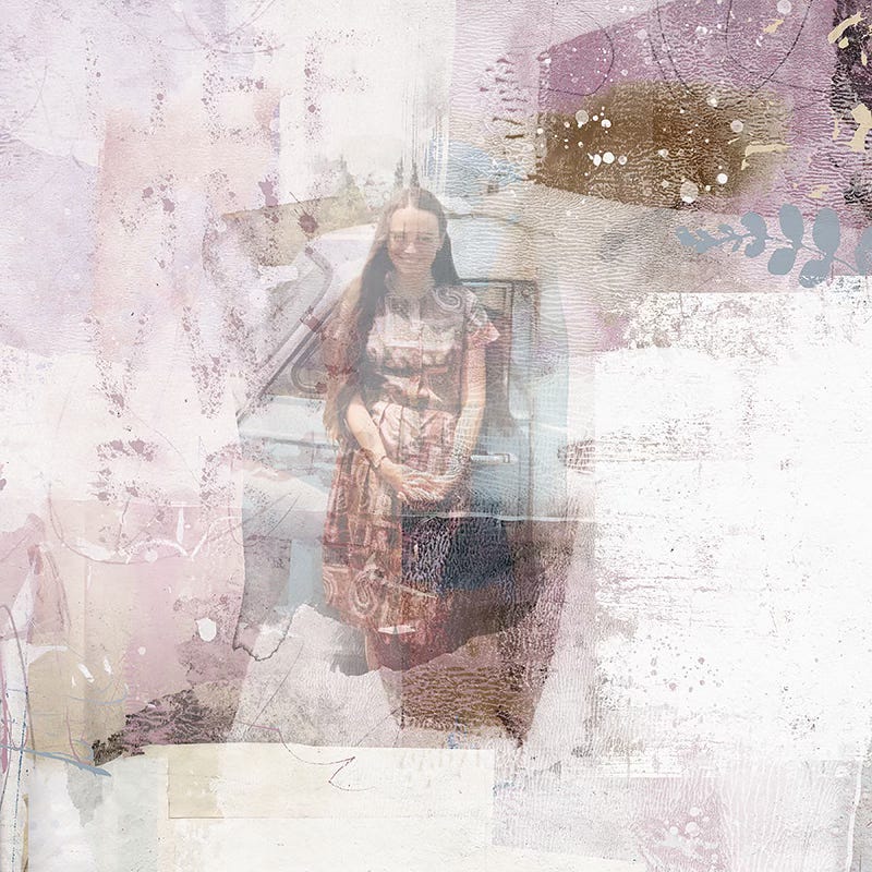
You can see the problem here immediately, can’t you?
But this is where my favourite trick comes into play.
I DUPLICATED that layer, and then I put the duplicated photo back onto ‘normal’ mode. Then I had fun reducing the opacity of it, and gently erasing parts of it (with an erasing brush that is not on 100% opacity) until I got a result I like.
It’s the sweet spot between the texture and interest of the paper being visible, but the detail in the photo reasonably retained.
Sometimes I might have the bottom version of the photo on overlay or soft light mode, and the top one on multiply mode at reduced opacity. Then I might up the brightness and contrast of the top layer. And then I might add a third layer. Just experiment and play around. Different photos on different backgrounds require different combos of blend modes.
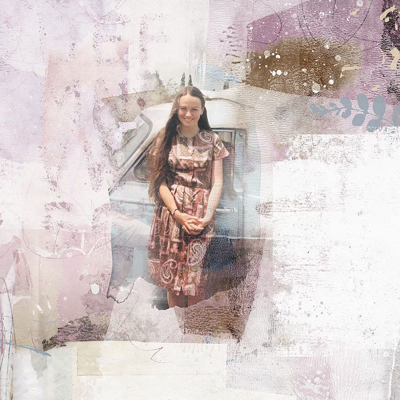
My final recipe for this photo to end up with the result at the top of the post was:
first photo layer on Linear mode at 36%
duplicated and put onto Normal blend mode at 61%, but most of this layer erased around the sides of the photo
duplicated and put onto Hard Light blend mode at 64%.
*FINISHING TOUCHES
Since the aim is to ‘blend’ the photo into your paper:
try using one of those soft erasing brushes on reduced opacity to continue softening the edges of your photo layer(s).
Maybe use your Dodge tool to lighten around the edges.
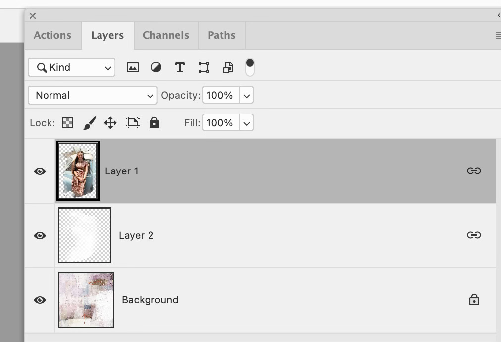
If there is too much texture or pattern from the background showing under parts of the photo (like faces) you can experiment with using a soft brush in a plain colour on a layer above the background and under the photo layers. See ‘Layer 2’ in the screenshot of the layers palette above.
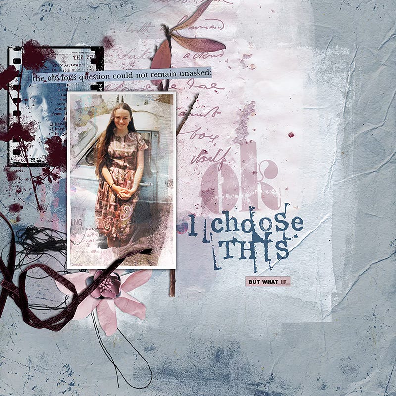
Play around with blending a photo then adding a frame over all or part of it, or even ‘cutting out’ the blended result and using it as the photo on a more traditional page, as I did below. Maybe printing it out and using it on a hybrid page.
‘JUDGED’ BY RACHEL
Following on from Lynn’s fab tips I used her idea of using one of our painted transfers as a ‘mask’ in order to create some imagery to support my background in a hybrid project.
The vintage photo included in the main Kit is what I wanted to use within my project but I wanted the female to look as though she was blended into my painted paper.
Here are my basic steps:
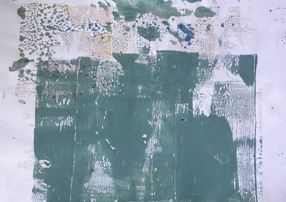
I hand painted a background ready for my journal spread (that I intend to print on later) - I took a photo of it and uploaded to my Mac and imported it into Photoshop so that I could create a ‘mock up’ of what i’d be printing . . .
With a little trial and error I eyeballed where I roughly wanted elements to be printed on the painted paper and positioned them in place and then hid the painted background paper.
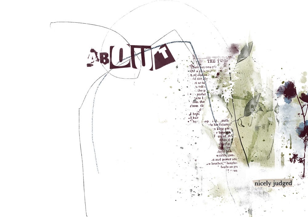
As per Lynn’s tips, I picked a painted transfer from our ‘Mixed Media’ Pack that had nice soft watery edges. This will serve as my ‘mask’. When using a transfer as a ‘mask’ i would normally colourise it one solid colour, but actually, I’d like a little colour peeking around the edges of the finished photo so I left it as-is.
I positioned the vintage photo above the painted transfer layer in photoshop, right clicked on the vintage photo layer and chose the ‘create clipping mask’ option.
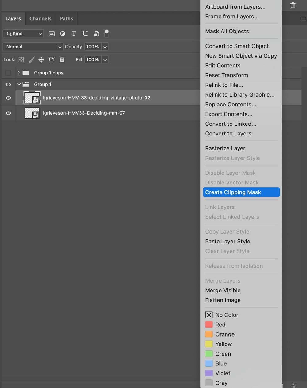
You can now see that the two are nested, or connected in the layers window.
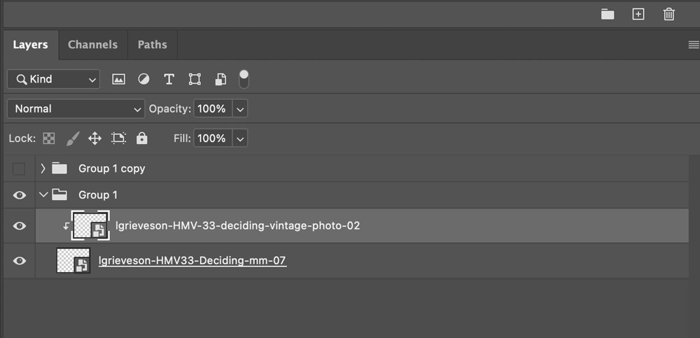
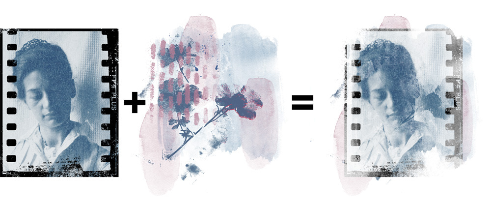
The size of the mask was originally larger than the vintage photo, I resized the mask layer by both width and height so that both are roughly the same size, apart from the little overhang of paint around the sides which I like as it adds a subtle pop of colour.
Ready for printing now . .
Rather than printing on white paper I actually fed my painted paper through the printer BUT I did make a little blunder which I’m gutted about and so the print finish was different than what I had intended.
This resulted in the green painterly transfer that’s under the photo not printing properly and thus changing the colour and tone of the vintage photo. Lesson learnt for next time I guess!
I went ahead and stuck it into my book anyway and after journaling I printed a few more elements to cut and layer to finish my page . . .
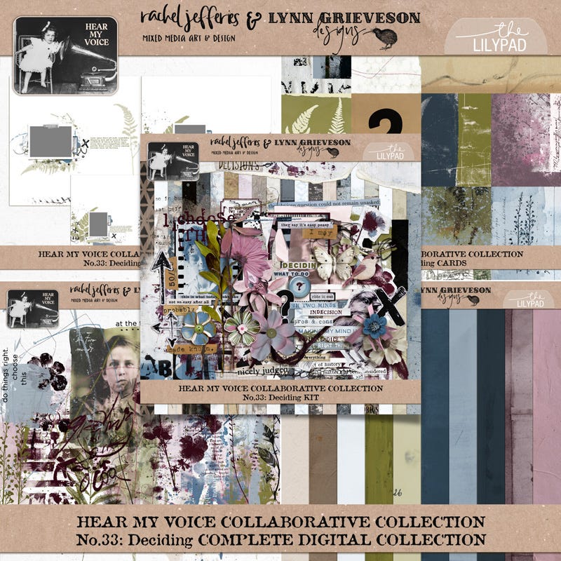
HEAR MY VOICE: DECIDING
The all new ‘Hear My Voice” collection ‘DECIDING’ (that we used above) has landed at the LilyPad this weekend and we’ve put together a video to share more inspiration behind the theme and lovely colourful and creative ideas for you.
Introductory pricing is available on all parts of the collection when purchased before the end of Sunday.
Your best value is always the full bundled collection which has a bonus discount applied to it this weekend!
Here are another couple of pages from us both:


Enjoy lots more inspiration at the gallery at The Lilypad :-)
Connect!
We always love to hear from you. What’s your favourite blending method? Any tips and tricks for non-Photoshop users?
And, as always, thank you ALL for reading and thank you for being here :-)
PS If you are a premium subscriber check your inbox on Sunday for more inspiration and chat about the ‘Breathe’ Project Kit gifted to you at the start of the month (don’t forget to download it before the end of the month!)
Lynn & Rachel
I need to get on the ball with life and stop missing all the deals!
This tutorial took you a long time to write. Well done and I hope it helps others a lot.
This is beautiful