


Life in Pictures Deconstructed No.12
Deep Dives into Page Design + Wednesday Half Price Offers


Join us on another trip down memory lane. Revisiting stories that we have been telling, deconstructing some of those page designs plus popping some of our older products on sale for this week’s flash sales.
PICKING A POP OF COLOUR, BY LYNN
My mother loved to sew clothes for us. This particular combo of long flowery dress and velveteen waistcoat was deep in the days of Holly Hobbie fervour!
I liked how the brown in the background looked like it would match well with parts of the collection I wanted to create with. But to make the photo work really well, I chose just a couple of little accent elements (flower and phrase tag) that matched my waistcoat.
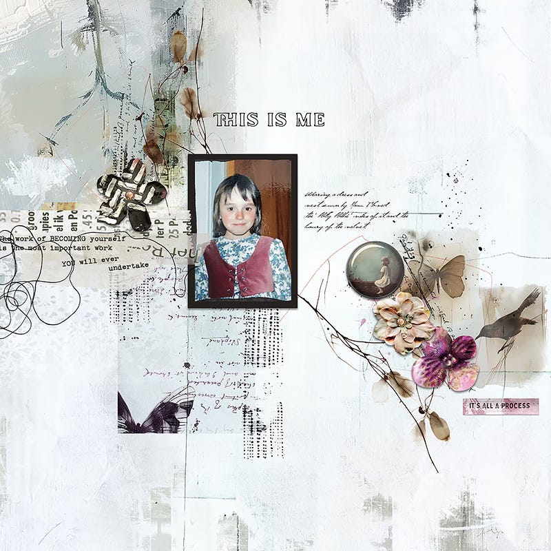
It’s a great recipe for a page as an alternative to going heavy on a colourful page. Just choose a neutral background (I usually go with white) and add some neutral paints and elements, before choosing just a couple of elements or splash of paint in a ‘hero colour’.
Rachel also made a page that was largely neutral but with some pops of colour in the form of burnt orange bead scatters.
Only in her case, she chose a contrasting colour to one in her photo - picking the teal of her top then going with orange as the contrast.
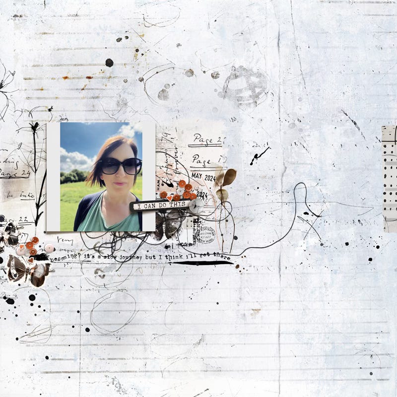
We both used the “Hear My Voice: Becoming” collection:

PORTRAIT SCRAPPING BY RACHEL
My little writing piece today is a shorter one as it’s been a weird old day, getting caught in a torrential downpour on the school run, returning to a leaky roof at home and sorting (and emptying and dousing one self in rainwater) buckets and cleaning up, doing a bit of work and then dashing back to school for a meeting.
Had to do an emergency de-clutter and big clean before I could rest in bed as the roofer can come around to help quote for the repairs - anyone else have to do a panic clean when someone is suddenly coming over at little to none notice? That sure gets me moving!
Taking a peek through my product folders I stumbled across these two layouts and it reminded me how Creative Team Members Gaelle and Marilyn nearly always scrap in portrait orientation.
That seems to leave more opportunity for negative space (breathing room) and it works so well, and it just so happens they both chose a very monochrome colour scheme and black and white photos to suit which I feel also aids in the breathing space too.
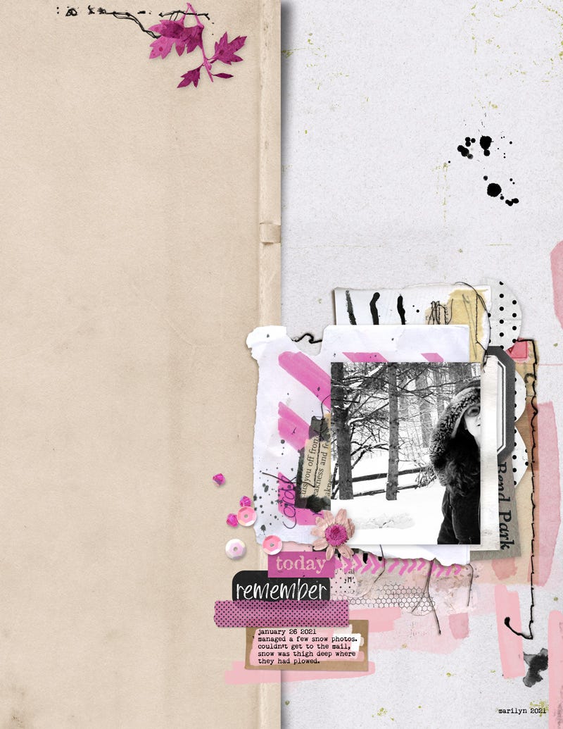
Really loving the pink leaves in the corner that have been stitched down, it really creates a mini diagonal flow seeing as Marilyn has chosen to create downwards and all the way into the bottom right corner.
I love her repetition of pink!
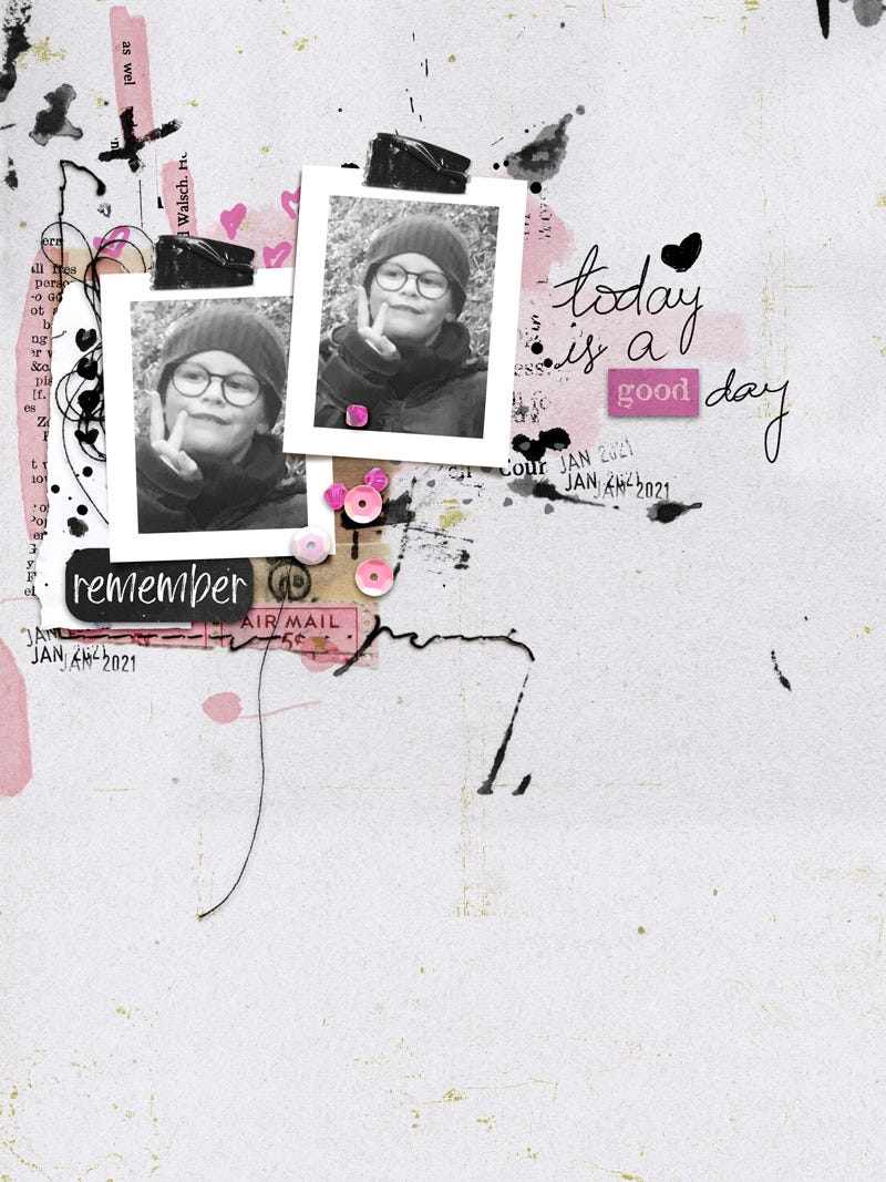
And who says you can’t create with a pink on a boys page?! Love that Gaelle did that, maybe as the page is from her perspective. Gorgeous how she has grown the design outwards using the splats and stitches and phrases and word art.
Two very different layouts but following similar principles and I adore them both!
Have you ever created in portrait orientation vs square before and did you like it?
WEDNESDAY SPECIALS
The examples shown above (plus many other products!) are included in our ‘Something Old Something New’ sale at the LilyPad which includes discounts of at least 50% off - save extra on bundled collections ;)
Find templates, elements, and collections for today only, 4 June 2025.

Leave us a comment, we’d love to connect and hear your thoughts :)
Thank you for reading and as always, thank you for being here :-)
Rachel & Lynn