


Life in Pictures Deconstructed No.15
Deep Dives into Page Design + Wednesday Half Price Offers
Join us on another trip down memory lane. Revisiting stories that we have been telling, deconstructing some of those page designs plus popping some of our older products on sale for this week’s flash sales.
KIT OR PHOTO FIRST? BY RACHEL
This came up in conversation the other day about our preferences with digital scrapbooking processes when choosing assets. Do you first choose a photo and then match the ‘perfect’ kit to it? Or do you first choose a kit and then find the ‘perfect’ match with a photo?
I don’t think there’s a right or a wrong way, and for various reasons I flit between the two. And the fun thing with digital or hybrid creating is that the tech can assist us in making the Kit (or the photo) work for us in if things are not quite right and need tweaking!
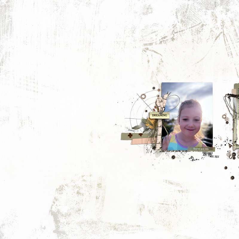
In this case, I was starting with the Kit first because i had just finished the design process, (plus I loved it and wanted to use it no matter what) and I needed to create my first page to ‘test things out’. That’s a process I always go through after creating a kit to make sure the balance between elements is just so, and it helps me to decide if the kit’s complete or if it needs one or two things more.
So, I could have selected a photo with a perfect colour match, and this one wasn’t bad, but in order to make things more cohesive I chose to pick an accent colour from my photo, in this case the ribbon on my hat, and do some basic recolouring of elements to make things feel as though they belong and bring that colour through in different areas of the page.
Recolouring can be a powerful tool with digital crafting when maybe you have a photo that you really really want to use, or a kit that you really really want to use but need to make the two more in tune with each other.
The tone of the kit itself was a lovely match to my sunny beach photo, the background paper was mostly neutral but already had that ‘glow’ about it so I was happy with that. I did however just blend in some stripes on the right hand side, to mount my photo and draw more attention to that area where the photo sits.

I used the colour picker tool to pick the shade of pink from the ribbon on my hat that I wanted repeated around the page and simply recoloured stamps and paints from the Kit and the Mixed Media Pack to bring those pops of cerise pink through.
Colour adjustments that I make when creating can vary, they can be:
A simple Layer Style with a Colour Overlay (that worked great for this layout)
An Image Adjustment > Selective Colour (great for targeting specific colours of an element for more refined recolouring)
An Image Adjustment > Hue/Saturation ( quick and easy for a more casual hue adjustment which i’d just eye ball for a good match or to mute colours somewhat)
Finally I sometimes use an Image Adjustment > Replace Colour (I tend to use this option when other re-colouring efforts have failed or if I need a complete colour replace on a solid block of colour)
If you’re reading and would like instructions or tutorials on colour adjustments let us know in the comments and we can work this into our future posts for you.
My example above is using digital assets from “Hear My Voice: Aspiring”.

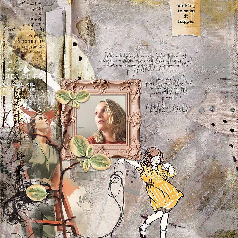
I made a second page and whilst I could have recoloured bits and bobs to match Mackenzie’s summery dress more I chose to keep the embellishments in their original colours.
There’s an exciting mix of Page Design Ideas with this collection to discover in the shop so please take a peek if you have time.
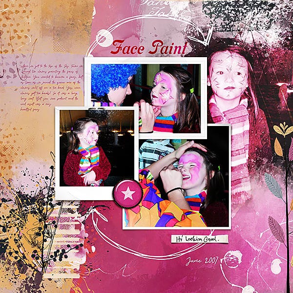
Lynn’s Page Design is in complete contrast to mine, packed with much more texture yet she’s still used a lot of negative space to give her design breathing room and she’s also found a beautiful photo match where her shirt marries up with those rusty tones of the paints in the page - stunning!!
TONE ON TONE BY LYNN
When you want to play with a photo that has a lot of bold and bright colour you have a few choices.
You can pair it with muted neutrals, or even desaturate and maximise your options for what to pair it with.
Or you can lean into it and make a really bold page with lots of strong colour:
OR you can choose more muted tones of the same colours that appear in the photo, as I did here:
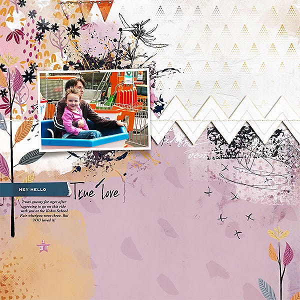
I “pulled” the colours from my daughter’s top and from the fairground ride but went with tones of those colours to complement but create a more restful feeling result.
Tone in colour theory refers to a hue (pure colour) or a mixture of pure colours to which neutral gray (a mixture of black and white, with no additional pigments) has been added, producing a version of the original colour that is less intense or saturated, resulting in a more subdued or muted appearance.
Many of my collections include a range of papers in varying tones of the same colour combinations so you can experiment with all sorts of different approaches.
The ones I used for my examples today are from the “Turning It Around” collection which has lots of tones of purple/lilac and orange/peach.


WEDNESDAY SPECIALS
The examples shown above (plus many other products!) are included in our ‘Something Old Something New’ sale at the LilyPad which includes discounts of at least 50% off - save extra on bundled collections ;)
Find templates, elements, and collections for today only, 25 June 2025.

(For those who only shop at Oscraps, we also have our ‘Weekly Oscraps Wonderful Deals’ ← there, with a smaller selection of specials - these vary a little from those on offer at the LilyPad so you may want to take a peek at the different specials.)
Leave us a comment, we’d love to connect and hear your thoughts :)
Thank you for reading and as always, thank you for being here :-)
Rachel & Lynn