


Uncovering Design Choices No.02
Dissecting and scraplifting a great page.

Hey there!
Due to a technical difficulty whilst filming, today’s scheduled hybrid feature for our premium subscribers has been pushed to Sunday the 25th of May.
Whilst you are waiting for that, we have the second post in our ‘Uncovering Design Choices’ series where we delve into (and scraplift) the design choices behind a page design that used the latest Project Kit (Breathe) that was gifted to subscribers at the start of the month.

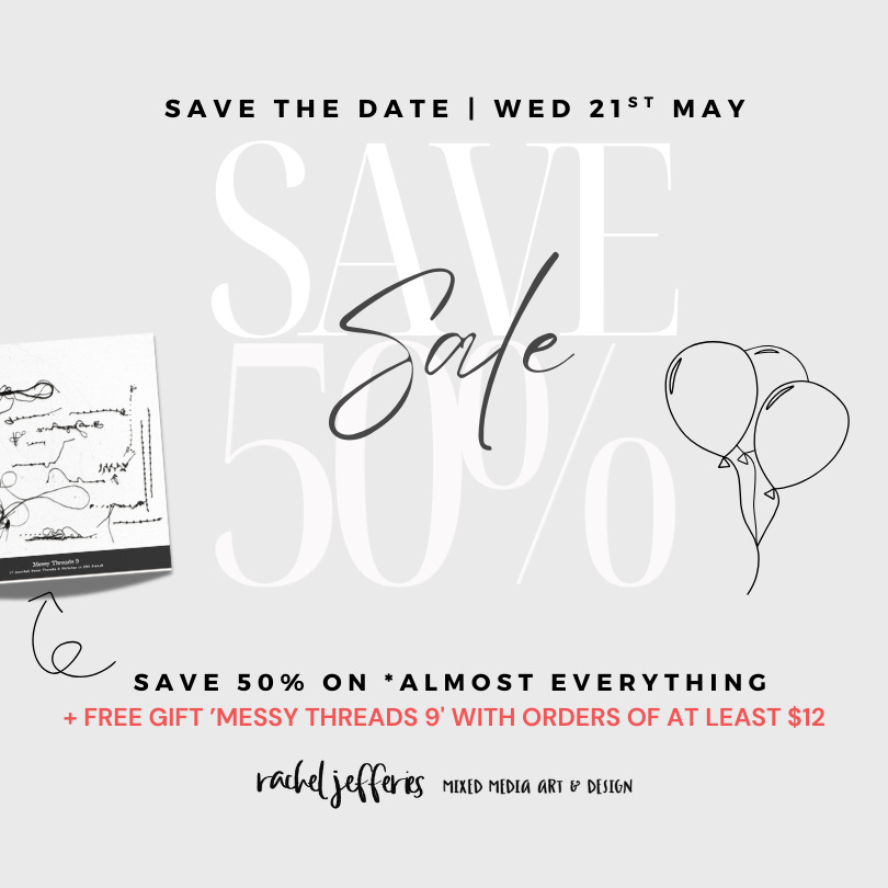
SAVE THE DATE
Before we get chatting about all things design, you may want to save the date of Wednesday the 21st of May because I’m celebrating my Birthday that week and you're invited to the party!
Keep an eye on your inbox for more details that will follow once the party is live!
UNCOVERING DESIGN CHOICES No.02
The first thing that stood out to me about this featured page by team member Aly is texture - and not just in the obvious ways.
At first glance, it feels calm and spacious, but it quietly draws you in. There are several clever techniques at play here and some are subtle, some more structured, but they work together to create a layout that feels so rich and very tactile.
Let’s walk through how Aly has achieved this look. We’ll go through a handful of techniques that you can adapt in your own digital or hybrid projects.